Creating rectangles, circles, and rounded rectangles is the basic of CSS. Creating more complex CSS shapes such as triangles, hexagons, stars, hearts, etc. is more challenging but still a simple task if we rely on modern features.
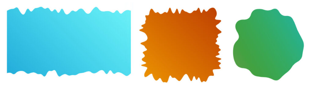
But what about those shapes having a bit of randomness and many curves?

A lot of names may apply here: random wavy, wiggly, blob, squiggly, ragged, torn, etc. Whatever you call them, we all agree that they are not trivial to create, and they generally belong to the SVG world or are created with tools and used as images. Thanks to the new shape() function, we can now build them using CSS.
I won’t tell you they are easy to create. They are indeed a bit tricky as they require a lot of math and calculation. For this reason, I built a few generators from which you can easily grab the code for the different shapes.
All you have to do is adjust the settings and get the code in no time. As simple as that!
While most of you may be tempted to bookmark the CSS generators and leave this article, I advise you to continue reading. Having the generators is good, but understanding the logic behind them is even better. You may want to manually tweak the code to create more shape variations. We will also see a few interesting examples, so stay until the end!
Notice: If you are new to shape(), I highly recommend reading my four-part series where I explain the basics. It will help you better understand what we are doing here.
How does it work?
While many of the shapes you can create with my generators look different, all of them rely on the same technique: a lot of curve commands. The main trick is to ensure two adjacent curve create a smooth curvature so that the full shape appears as one continuous curve.
Here is a figure of what one curve command can draw. I will be using only one control point:

Now, let’s put two curves next to each other:

The ending point of the first curve, E1, is the starting point of the second curve, S2. That point is placed within the segment formed by both the control points C1 and C2. That’s the criterion for having an overall smooth curve. If we don’t have that, we get a discontinued “bad” curve.

All we have to do is to randomly generate different curves while respecting the previous criterion between two consecutive curves. For the sake of simplicity, I will consider the common point between two curves to be the midpoint of the control points to have less randomness to deal with.
Creating the shapes
Let’s start with the easiest shape, a random wavy divider. A random curve on one side.

Two variables will control the shape: the granularity and the size. The granularity defines how many curves we will have (it will be an integer). The size defines the space where the curves will be drawn.

The first step is to create N points and evenly place them at the bottom of the element (N is the granularity).

Then, we randomly offset the vertical position of the points using the size variable. Each point will have an offset equal to a random value within the range [0 size].

From there, we take two adjacent points and define their midpoint. We get more points.

Do you start to see the idea? A first set of points is randomly placed while a second set is placed in a way that meets the criterion we defined previously. From there, we draw all the curves, and we get our shape.
The CSS code will look like this:
.shape {
  clip-path: shape(from Px1 Py1,
    curve to Px2 Py2 with Cx1 Cy1,
    curve to Px3 Py3 with Cx2 Cy2,
    /* ... */
    curve to Pxi Pyi with Cx(i-1) Cy(i-1)
    /* ... */
  )
}
The Ci are the points we randomly place (the control points) and Pi are the midpoints.
From there, we apply the same logic to the different sides to get different variation (bottom, top, bottom-top, all sides, etc.).

As for the blob, the logic is slightly different. Instead of considering a rectangular shape and straight lines, we use a circle.

We evenly place the points around the circle (the one formed by the element if it has border-radius: 50%). Then, we randomly offset them closer to the center. Finally, we add the midpoints and draw the shape.

We can still go fancier and combine the first technique with the circular one to consider a rectangle with rounded corners.

This was the trickiest one to implement as I had to deal with each corner, each side, and work with different granularities. However, the result was quite satisfying as it allows us to create a lot of fancy frames!
Show me the cool demos!
Enough theory, let’s see some cool examples and how to simply use the generators to create complex-looking shapes and animations.
We start with a classic layout featuring numerous wavy dividers!
We have four shapes in that demo, and all of them are a simple copy/paste from the wavy divider generator. The header uses the bottom configuration, the footer uses the top configuration and the other elements use the top + bottom configuration.
Let’s get fancy and add some animation.
Each element will have the following code:
@media screen and (prefers-reduced-motion: no-preference) {
  .element {
    --s1: shape( ... );
    --s2: shape( ... );
    animation: dance linear 1.6s infinite alternate;
  }

  @keyframes dance {
    0% {clip-path: var(--s1)}
    to {clip-path: var(--s2)}
  }
}
From the generator, you fix the granularity and size, then you generate two different shapes for each one of the variables (--s1 and --s2). The number of curves will be the same, which means the browser can have an interpolation between both shapes, hence we get a nice animation!
And what about introducing scroll-driven animation to have the animation based on the scroll? All you have to do is add animation-timeline: scroll() and it’s done.
Here is the same effect with a sticky header.
For this one, you play with the size. You fix the granularity and the shape ID then you consider a size equal to 0 for the initial shape (a rectangle) and a size different from 0 for the wavy one. Then you let the browser animate between both.
Do you see all the possibilities we have? You can either use the shapes as static decorations or create fancy animations between two (or more) by using the same granularity and adjusting the other settings (size and shape ID).
What cool demo can you create using those tricks? Share it in the comment section.
I will leave you with more examples you can use as inspiration.
A bouncing hover effect with blob shapes:
A squishy button with a hover and click effect:
And a set of fancy CSS loaders you can find at my site.
Conclusion
Do you see all the potential of the new shape() function? We now have the opportunity to create complex-looking shapes without resorting to SVG or images. In addition to that, we can easily have nice transition/animation.
Don’t forget to bookmark my CSS Generators website, from where you can get the code of the shapes we studied and more. I also have the CSS Shape website which I will soon update to utilize the new shape() for most of the shapes and optimize a lot of old code!
What about you? Can you think about a complex shape we can create using shape()? Perhaps you can give me the idea for my next generator!
Making Complex CSS Shapes Using shape() originally published on CSS-Tricks, which is part of the DigitalOcean family. You should get the newsletter.