In the previous article, we built the classic hexagon grid. It was a responsive implementation without the use of media queries. The challenge was to improve a five-year old approach using modern CSS.
Support is limited to Chrome only because this technique uses recently released features, including corner-shape, sibling-index(), and unit division.
In this article, we will explore another type of grid: a pyramidal one. We are still working with hexagon shapes, but a different organization of the elements.
A demo worth a thousand words:
For better visualization, open the full-page view of the demo to see the pyramidal structure. On screen resize, you get a responsive behavior where the bottom part starts to behave similarly to the grid we created in the previous article!

Cool right? All of this was made without a single media query, JavaScript, or a ton of hacky CSS. You can chunk as many elements as you want, and everything will adjust perfectly.
Before we start, do yourself a favor and read the previous article if you haven’t already. I will skip a few things I have already explained there, such as how the shapes are created as well as a few formulas I will reuse here. Similar to the previous article, the implementation of the pyramidal grid is an improvement of a five-year old approach, so if you want to make a comparison between 2021 and 2026, check out that older article as well.
The Initial Configuration
This time, we will rely on CSS Grid instead of Flexbox. With this structure, it’s easy to control the placement of items inside columns and rows rather than adjusting margins.
<div class="container">
  <div></div>
  <div></div>
  <div></div>
  <div></div>
  <!-- etc. -->
</div>
.container {
--s: 40px; /* size */
--g: 5px; /* gap */
display: grid;
grid-template-columns: repeat(auto-fit, var(--s) var(--s));
justify-content: center;
gap: var(--g);
}
.container > * {
grid-column-end: span 2;
aspect-ratio: cos(30deg);
border-radius: 50% / 25%;
corner-shape: bevel;
margin-bottom: calc((2*var(--s) + var(--g))/(-4*cos(30deg)));
}I am using the classic repeated auto-fit to create as many columns as the free space allows. For the items, it’s the same code of the previous article for creating hexagon shapes.
You wrote
var(--s)twice. Is that a typo?
It’s not! I want my grid to always have an even number of columns, where each item spans two columns (that’s why I am using grid-column-end: span 2). With this configuration, I can easily control the shifting between the different rows.

Above is a screenshot of DevTools showing the grid structure. If, for example, item 2 spans columns 3 and 4, then item 4 should span columns 2 and 3, item 5 should span columns 4 and 5, and so on.
It’s the same logic with the responsive part. Each first item of every other row is shifted by one column and starts on the second column.

With this configuration, the size of an item will be equal to 2*var(--s) + var(--g). For this reason, the negative bottom margin is different from the previous example.
So, instead of this:
margin-bottom: calc(var(--s)/(-4*cos(30deg)));…I am using:
margin-bottom: calc((2*var(--s) + var(--g))/(-4*cos(30deg)));Nothing fancy so far, but we already have 80% of the code. Believe it or not, we are only one property away from completing the entire grid. All we need to do is set the grid-column-start of a few elements to have the correct placement and, as you may have guessed, here comes the trickiest part involving a complex calculation.
The Pyramidal Grid
Let’s suppose the container is large enough to contain the pyramid with all the elements. In other words, we will ignore the responsive part for now. Let’s analyze the structure and try to identify the patterns:

Regardless of the number of items, the structure is somehow static. The items on the left (i.e., the first item of each row) are always the same (1, 2, 4, 7, 11, and so on). A trivial solution is to target them using the :nth-child() selector.
:nth-child(1) { grid-column-start: ?? }
:nth-child(2) { grid-column-start: ?? }
:nth-child(4) { grid-column-start: ?? }
:nth-child(7) { grid-column-start: ?? }
:nth-child(11) { grid-column-start: ?? }
/* etc. */
The positions of all of them are linked. If item 1 is placed in column x, then item 2 should be placed in column x - 1, item 4 in column x - 2, and so forth.
:nth-child(1) { grid-column-start: x - 0 } /* 0 is not need but useful to see the pattern*/
:nth-child(2) { grid-column-start: x - 1 }
:nth-child(4) { grid-column-start: x - 2 }
:nth-child(7) { grid-column-start: x - 3 }
:nth-child(11) { grid-column-start: x - 4 }
/* etc. */
Item 1 is logically placed in the middle, so if our grid contains N columns, then x is equal to N/2:
:nth-child(1) { grid-column-start: N/2 - 0 }
:nth-child(2) { grid-column-start: N/2 - 1 }
:nth-child(4) { grid-column-start: N/2 - 2 }
:nth-child(7) { grid-column-start: N/2 - 3 }
:nth-child(11){ grid-column-start: N/2 - 4 }
And since each item spans two columns, N/2 can also be seen as the number of items that can fit within the container. So, let’s update our logic and consider N to be the number of items instead of the number of columns.
:nth-child(1) { grid-column-start: N - 0 }
:nth-child(2) { grid-column-start: N - 1 }
:nth-child(4) { grid-column-start: N - 2 }
:nth-child(7) { grid-column-start: N - 3 }
:nth-child(11){ grid-column-start: N - 4 }
/* etc. */
To calculate the number of items, I will use the same formula as in the previous article:
N = round(down, (container_size + gap)/ (item_size + gap));The only difference is that the size of an item is no longer var(--s)but 2*var(--s) + var(--g), which gives us the following CSS:
.container {
  --s: 40px;  /* size  */
  --g: 5px;   /* gap */

  container-type: inline-size; /* we make it a container to use 100cqw */
}

.container > * {
  --_n: round(down,(100cqw + var(--g))/(2*(var(--s) + var(--g))));
}

.container > *:nth-child(1) { grid-column-start: calc(var(--_n) - 0) }
.container > *:nth-child(2) { grid-column-start: calc(var(--_n) - 1) }
.container > *:nth-child(4) { grid-column-start: calc(var(--_n) - 2) }
.container > *:nth-child(7) { grid-column-start: calc(var(--_n) - 3) }
.container > *:nth-child(11){ grid-column-start: calc(var(--_n) - 4) }
/* etc. */It works! We have our pyramidal structure. It’s not yet responsive, but we will get there. By the way, if your goal is to build such a structure with a fixed number of items, and you don’t need responsive behavior, then the above is perfect and you’re done!
How come all the items are correctly placed? We only defined the column for a few items, and we didn’t specify any row!
That’s the power of the auto-placement algorithm of CSS Grid. When you define the column for an item, the next one will be automatically placed after it! We don’t need to manually specify a bunch of columns and rows for all the items.
Improving the Implementation
You don’t like those verbose :nth-child() selectors, right? Me too, so let’s remove them and have a better implementation. Such a pyramid is well known in the math world, and we have something called a triangular number that I am going to use. Don’t worry, I will not start a math course, so here is the formula I will be using:
j*(j + 1)/2 + 1 = index…where j is a positive integer (zero included).
In theory, all the :nth-child can be generated using the following pseudo code:
for(j = 0; j< ?? ;j++) {
  :nth-child(j*(j + 1)/2 + 1) { grid-column-start: N - j }
}
We don’t have loops in CSS, so I will follow the same logic I did in the previous article (which I hope you read, otherwise you will get a bit lost). I express j using the index. I solved the previous formula, which is a quadratic equation, but I am sure you don’t want to get into all that math.
j = sqrt(2*index - 1.75) - .5We can get the index using the sibling-index() function. The logic is to test for each item if sqrt(2*index - 1.75) - .5 is a positive integer.
.container {
  --s: 40px; /* size  */
  --g: 5px; /* gap */

  container-type: inline-size; /* we make it a container to use 100cqw */
}
.container > * {
  --_n: round(down,(100cqw + var(--g))/(2*(var(--s) + var(--g))));
  --_j: calc(sqrt(2*sibling-index() - 1.75) - .5);
  --_d: mod(var(--_j),1);
  grid-column-start: if(style(--_d: 0): calc(var(--_n) - var(--_j)););
}
When the --_d variable is equal to 0, it means that --_j is an integer; and when that’s the case I set the column to N - j. I don’t need to test if --_j is positive because it’s always positive. The smallest index value is 1, so the smallest value of --_j is 0.
Tada! We replaced all the :nth-child() selectors with three lines of CSS that cover any number of items. Now let’s make it responsive!
The Responsive Behavior
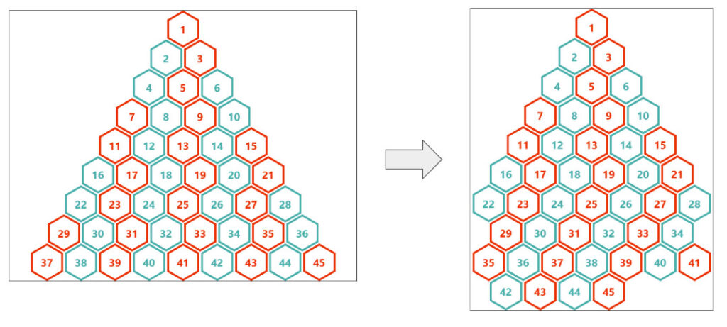
Back in my 2021 article, I switched between the pyramidal grid and the classic grid based on screen size. I will do something different this time. I will keep building the pyramid until it’s no longer possible, and from there, it will turn into the classic grid.

Items 1 to 28 form the pyramid. After that, we get the same classic grid we built in the previous article. We need to target the first items of some rows (29, 42, etc.) and shift them. We are not going to set a margin on the left this time, but we do need to set their grid-column-start value to 2.
As usual, we identify the formula of the items, express it using the index, and then test if the result is a positive integer or not:
N*i + (N - 1)*(i - 1) + 1 + N*(N - 1)/2 = indexSo:
i = (index - 2 + N*(3 - N)/2)/(2*N - 1)When i is a positive integer (zero excluded), we set the column start to 2.
.container {
  --s: 40px; /* size  */
  --g: 5px; /* gap */

  container-type: inline-size; /* we make it a container to use 100cqw */
}
.container > * {
  --_n: round(down,(100cqw + var(--g))/(2*(var(--s) + var(--g))));

  /* code for the pyramidal grid */
  --_j: calc(sqrt(2*sibling-index() - 1.75) - .5);
  --_d: mod(var(--_j),1);
  grid-column-start: if(style(--_d: 0): calc(var(--_n) - var(--_j)););

  /* code for the responsive grid */
  --_i: calc((sibling-index() - 2 + (var(--_n)*(3 - var(--_n)))/2)/(2*var(--_n) - 1));
  --_c: mod(var(--_i),1);
  grid-column-start: if(style((--_i > 0) and (--_c: 0)): 2;);
}
Unlike the --_j variable, I need to test if --_i is a positive value, as it can be negative for some index values. For this reason, I have an extra condition compared to the first one.
But wait! That’s no good at all. We are declaring grid-column-start twice, so only one of them will get used. We should have only one declaration, and for that, we can combine both conditions using a single if() statement:
grid-column-start:
if(
  style((--_i > 0) and (--_c: 0)): 2; /* first condition */
  style(--_d: 0): calc(var(--_n) - var(--_j)); /* second condition */
);
If the first condition is true (the responsive grid), we set the value to 2; else if the second condition is true (the pyramidal grid), we set the value to calc(var(--_n) - var(--_j)); else we do nothing.
Why that particular order?
Because the responsive grid should have a higher priority. Check the figure below:

Item 29 is part of the pyramidal grid since it’s the first item in its row. This means that the pyramidal condition will always be true for that item. But when the grid becomes responsive, that item becomes part of the responsive grid, and the other condition is also true. When both conditions are true, the responsive condition one should win; that’s why it’s the first condition we test.
Let’s see this in play:
Oops! The pyramid looks good, but after that, things get messy.
To understand what is happening, let’s look specifically at item 37. If you check the previous figure, you will notice it’s part of the pyramidal structure. So, even if the grid becomes responsive, its condition is still true and it gets a column value from the formula calc(var(--_n) - var(--_j)) which is not good because we want to keep its default value for auto-placement. That’s the case for many items, so we need to fix them.
To find the fix, let’s see how the values in the pyramid behave. They all follow the formula N - j, where j is a positive integer. If, for example, N is equal to 10 we get:
10, 9, 8, 7, ... ,0, -1 , -2At certain points, the values become negative, and since negative values are valid, those items will be randomly placed, disrupting the grid. We need to ensure the negative values are ignored, and the default value is used instead.
We use the following to keep only the positive value and transform all the negative ones into zeroes:
max(0, var(--_n) - var(--_j))We set 0 as a minimum boundary (more on that here) and the values become:
10, 9, 8, 7, ... , 0, 0, 0, 0We either get a positive value for the column or we get 0.
But you said the value should be the default one and not
0.
Yes, but 0 is an invalid value for grid-column-start, so using 0 means the browser will ignore it and fall back to the default value!
Our new code is:
grid-column-start:
  if(
    style((--_i > 0) and (--_c: 0)): 2; /* first condition */
    style(--_d: 0): max(0,var(--_n) - var(--_j)); /* second condition */
  );
And it works!
You can add as many items as you want, resize the screen, and everything will fit perfectly!
More Examples
Enough code and math! Let’s enjoy more variations using different shapes. I’ll let you dissect the code as homework.
Rhombus grid
You will notice a slightly different approach for setting the gap between the elements in the next three demos.
Octagon grid
Circle grid
And the other hexagon grid:
Conclusion
Do you remember when I told you that we were one property away from completing the grid? That one property (grid-column-start) took us literally the whole article to discuss! This demonstrates that CSS has evolved and requires a new mindset to work with. CSS is no longer a language where you simply set static values such color: red, margin: 10px, display: flex, etc.
Now we can define dynamic behaviors through complex calculations. It’s a whole process of thinking, finding formulas, defining variables, creating conditions, and so on. That’s not something new since I was able to do the same in 2021. However, we now have stronger features that allow us to have less hacky code and more flexible implementations.
Making a Responsive Pyramidal Grid With Modern CSS originally published on CSS-Tricks, which is part of the DigitalOcean family. You should get the newsletter.