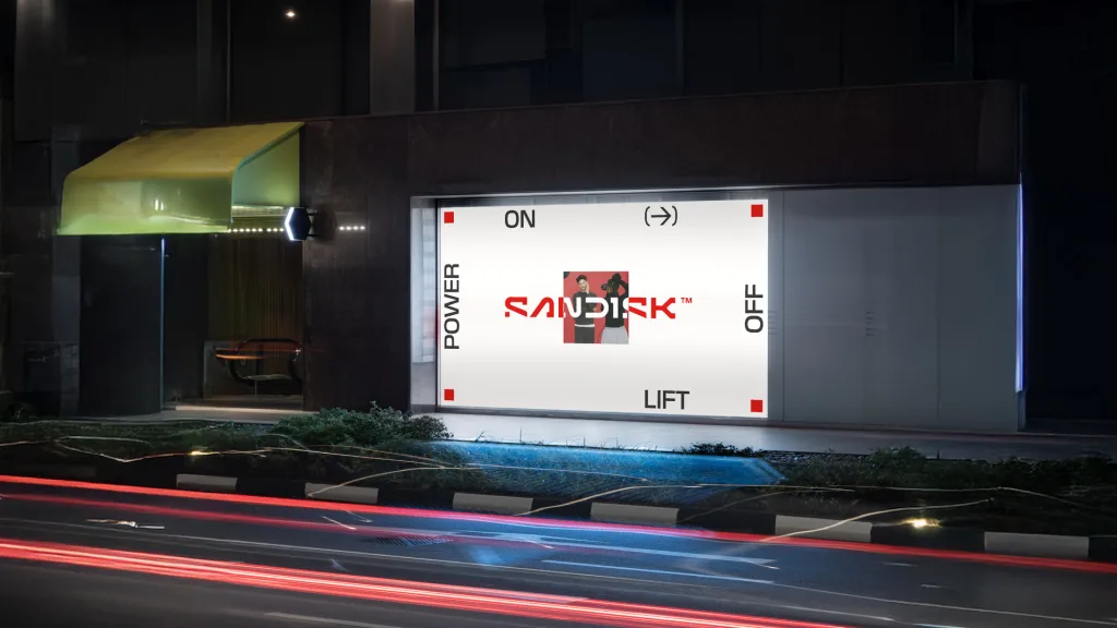
Sandisk Corporation—synonymous with flash drives, memory cards, and digital storage—has redefined its visual identity with a bold, minimalist new logo. The inspiration? A single pixel.
“It all started with the pixel, which is the fundamental smallest unit of data,” explains Andre Filip, CEO of ELA Advertising, the agency behind the redesign.
Sandisk worked on the new look ahead of its highly anticipated spin-off from parent company Western Digital planned for next year.
The Logo: A Modernized Minimalism
The updated design is sleek, futuristic, and packed with symbolism. Sandisk’s recognizable open ‘D’ remains, but the standout feature is the revamped ‘S’: a pared-down form shaped into a cone and a square pixel.
“It’s the first letter; it’s like the cornerstone of the company,” says Joel Davis, Sandisk’s Vice President of Creative. If the pixel seems NASA-inspired, it’s no accident. “We actually asked ourselves, ‘What would this look like on a spaceship?’” Davis reveals.
Sandisk now boasts two versions of its logo—vertical and horizontal—ensuring flexibility across digital and physical branding.
A Legacy Redefined
Founded as SunDisk in 1988 and renamed in 1995, Sandisk has seen decades of technological evolution. Western Digital acquired the company in 2016 for a staggering $15.59 billion, but as part of an upcoming business split, Sandisk’s flash storage division will emerge as its own entity.
The logo redesign marks a pivotal moment in Sandisk’s story.
Image courtesy of Sandisk
Why Should Designers Care?
Sandisk’s rebrand shows that even practical, hardware-focused companies can embrace storytelling and emotional impact. This isn’t just about storage devices; it’s about empowering progress for creators, businesses, and individuals.
For designers, the lesson is clear: a logo is just one part of a larger narrative. Sandisk’s redesign proves that minimalism can still feel dynamic and alive, while delivering a scalable, timeless identity that sets a new benchmark for tech brands.
Image courtesy of Sandisk
A One-Shot Opportunity
For the team behind the new design, this wasn’t just another update—it was a statement. “The brand has been around since the late ’80s,” Davis says, “and while it’s a great logo, we really had this one opportunity to bring the company into the future.”
And the future, it seems, begins with a single pixel.


